Reports
Overview
One of the core features of the Ternary platform is the ability to create customized, actionable reports that help establish cost transparency and foster collaboration across teams. While reports can be created and used as standalone items, they are most often created and added as widgets to a custom dashboard.
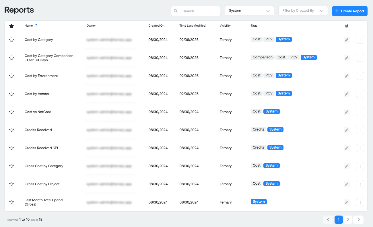
System Reports
Ternary offers a set of System Reports that are available out-of-the-box to all customers. These reports come pre-configured with commonly viewed cloud cost data, offering valuable insights right out of the box. You can use these reports as-is or copy and customize them to better suit your specific needs. To access System Reports, simply filter using the "System" tag. These reports provide a solid foundation for understanding your cloud spend and can be easily adapted for deeper analysis.
Examples of system reports include: Cost by Vendor, Gross Cost by Category, Monthly Spend to Date, Top 10 Credits by Service Description, etc.
Create a Report
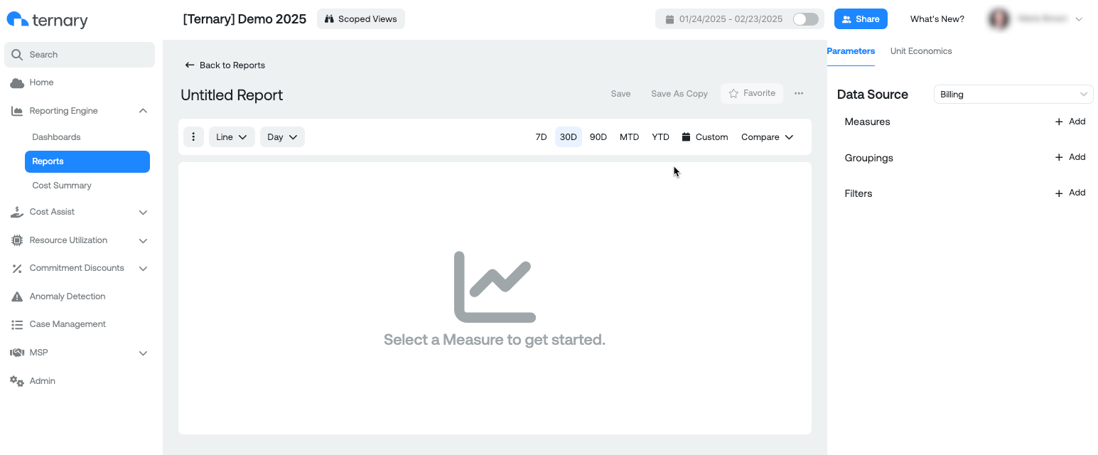
Creating reports in Ternary allows you to analyze your data in a way that fits your needs. Follow the steps below to create a report:
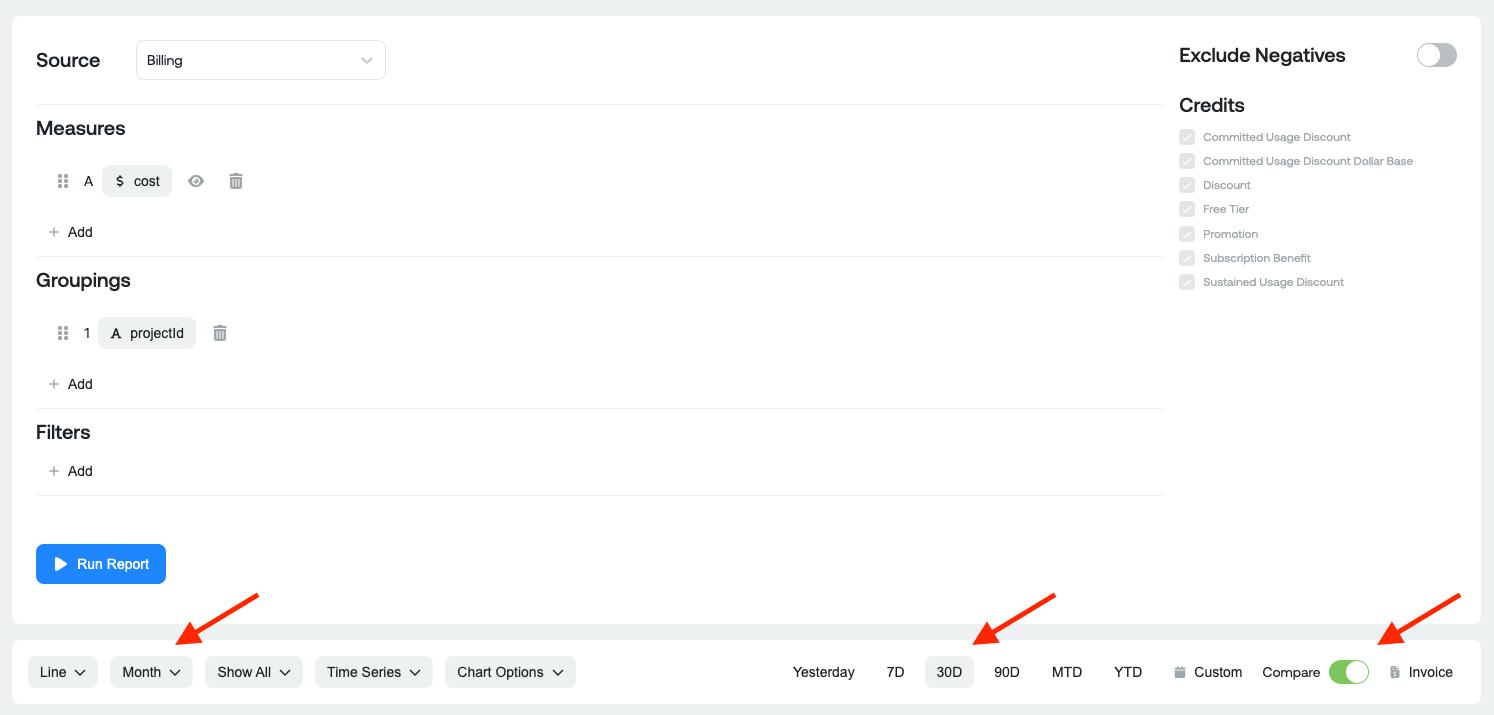
1. Select the Data Source
Choose the data source you want to report on, such as Billing, BigQuery usage, or any other integrated data source available in Ternary.
2. Select the Measures
Measures are the key metrics you want to track. You can select from options such as Cost, Net Cost, Usage Amount, etc.
3. Select the Groupings
Grouping allows you to organize your data based on different categories. You may select anything that's available in the billing export (e.g. SKU Description or Project ID), as well as labels you created natively in the cloud provider native console, and Custom Labels (e.g. Application, Team Leader, etc.) that exist in Ternary.
Preferred Labels: Any preferred labels, you have set in the Admin page, will be surfaced at the top of the dropdown list when you select "Add". You can modify your preferred labels from the Admin page => Labels.
4. Apply Filters
Filter your data by your preferred custom labels or any other dimensions. This allows you to drill down further into specific subsets of your data. You have a few different operators available to you when filtering:
- Equals / Does NOT Equal
- Contains / Does NOT Contain
- Is set / Is NOT Set
5. Optional fields
Click on the ellipses menu (three dots) in the upper left of the screen. Here you will see several options for limiting the data displayed. Choose from Top 5, Top 10, Top 15, or Top 20 results, or select Show All Results to display the complete dataset. Check the current settings configured for the x-axis (time periods, categories, etc.) and the credits (how credits are represented in the report).
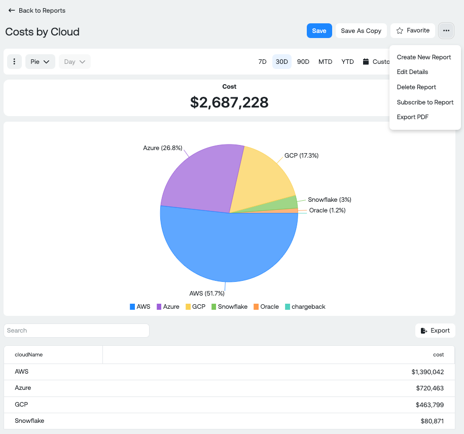
6. Change the visualization (Optional)
The Report defaults to a Line chart, but the platform allows you to choose from the following visual chart types to best represent your data:
- Line
- Area
- Stacked Area
- Stacked Bar
- Clustered Bar
- Pie
- KPI
- Table
7. Set date range and granularity
By default, the report editor is set to 30 days, but you customize the date range by selecting:
- 7 days
- 90 days
- Month-to-date (MTD)
- Year-to-date (YTD)
- Custom date range (Fixed, Rolling, or Invoice period). Note: To reconcile with your monthly cloud provider invoice, you should select invoice month.
You can also choose the level of granularity for your report:
- Hour
- Day
- Week
- Month
- Quarter
8. Generate and Save the Report
After you've configured all settings, click Generate Report to see your customized report. You can save it and a pop up will appear asking you to title the report for later reference or for use in a dashboard.
Available Report Actions
After you've built a report following the above steps, you have several actions available, such as:
-
Save a copy of the report
-
Favorite the report
-
Export time series data or table data into CSV or PDF - REPORT MUST BE SAVED FIRST
-
Create a new report
-
Navigate to the Report Management page
Report Management
The Report Management page, accessible under Ternary Reporting Engine > Reports, provides a range of options for managing your reports. By clicking the ellipses menu next to any dashboard, you can:
- View the selected report.
- Edit the Details (name and tags) of an existing report.
- Delete a report you no longer need.
- Create a Report Subscription to receive email updates for any report. You can set up subscriptions for both Ternary users and external recipients by entering email addresses. Customize the frequency (daily, weekly, or monthly) and specify the time for delivery. Multiple subscriptions can be created for the same report.
Additionally, you can Favorite reports by clicking the star icon next to the report name for quick access. These options provide full flexibility in organizing and collaborating with your reports.
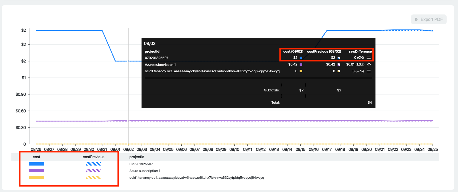
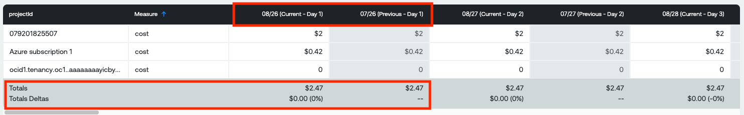
Time period comparison reports
- Select your Measure, Groupings and Filters
- On the tool bar to select Chart type, Granularity and Date Range select the Granularity for comparison (Hour/Day/Week/Month), the date range and click the Compare slider
- Click the Run Report Icon
- In the graph, you should now see the 2 previous period on the graph denoted with a dotted line
- You will also see, in the table, the difference in $'s and Percentage in the bottom row
Compare Button:
Example Graph representation:
Example Table representation:
Updated about 1 month ago