Reports
Learn how Ternary Reports enable teams to analyze cloud cost data, track trends, and support data-driven cost decisions across the organization.
Ternary Reports help teams turn raw cloud cost and usage data into structured, actionable insights. They are used to analyze spend patterns, track cost drivers, compare time periods, and support decision-making across engineering, finance, and FinOps teams. While reports can be used independently, they are often embedded into Custom Dashboards, where they are commonly used to monitor trends, investigate anomalies, and share consistent cost views with stakeholders.
What types of reports does Ternary provide?
System Reports
System Reports are pre-configured reports available to all Ternary customers and are designed to cover common cloud cost analysis needs. They provide ready-to-use views of spend, usage, and credits, and can be used as-is or copied and customized for deeper analysis. System Reports can be accessed by filtering using the System tag.
Examples of system reports include: Cost by Vendor, Gross Cost by Category, Monthly Spend to Date, and Top 10 Credits by Service Description.
Custom Reports
Custom Reports allow users to build reports tailored to specific analysis requirements. Users can choose data sources, metrics, groupings, filters, and visualizations to answer targeted cost and usage questions. Custom Reports are often used as standalone analysis tools or embedded into dashboards for ongoing monitoring.
How to create reports in Ternary?
-
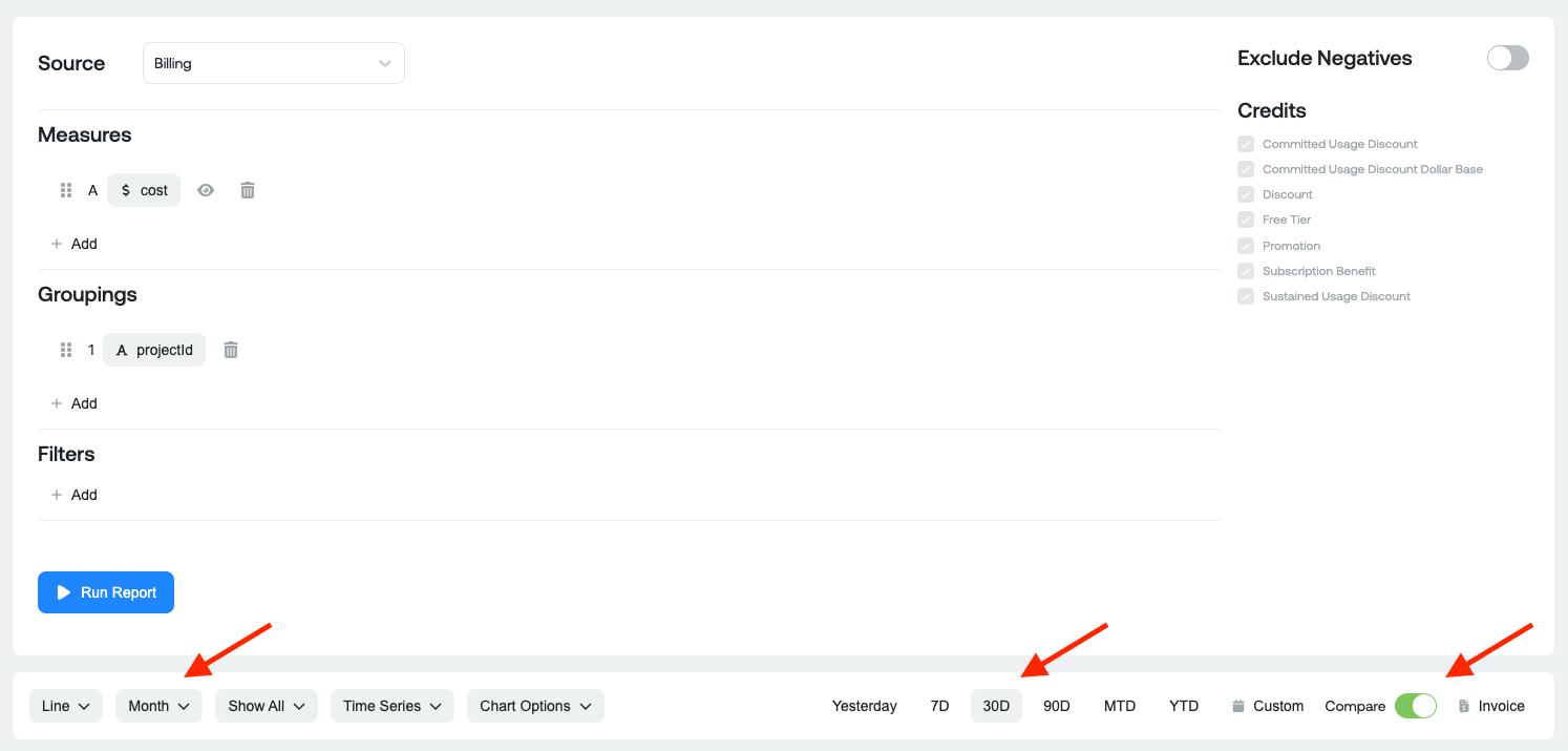
Select a data source By default, reports use FOCUS Billing as the data source. You can also select additional data sources to report on, such as billing data, BigQuery usage, or any other integrated source available in Ternary.
-
Select the Measures Measures define what is being tracked in the report. Common measures include billed cost, effective cost, list cost, usage amount, and similar metrics.
-
Define groupings Organize data by selecting dimensions available in the billing export, such as SKU Description or Project ID, along with cloud-native labels and Ternary Custom Labels (e.g. Application, Team Leader, etc.). Preferred labels configured in the Admin settings appear at the top of the selection list.
-
Apply filters Refine the dataset by applying filters on dimensions or labels using supported operators, including
- Equals / Does NOT Equal
- Contains / Does NOT Contain
- Is set / Is NOT Set
-
Configure optional settings Use the ellipses menu (three dots in the upper left of the screen) to limit the number of results shown, select how credits are represented, and review x-axis settings such as time periods or category breakdowns.
-
Choose a visualization (Optional) Choose an appropriate chart or table format to represent the data, including Line, Area, Stacked Area, Stacked Bar, Clustered Bar, Pie, Variance, KPI, or Table.
-
Set date range and granularity By default, the report editor is set to 30 days, but it can be customized to the following options: 7 days, 90 days, month-to-date, year-to-date, or a custom range including fixed, rolling, or invoice periods. Note: To reconcile with your monthly cloud provider invoice, you should select invoice month. Granularity can be set to Hour, Day, Week, Month, or Quarter.
-
Generate and save the report Generate the report to preview results, then save it with a defined name for future reference or use within dashboards. Reports must be saved before they can be exported or added to dashboards.
-
Perform report actions Once saved, additional actions are available, including saving a copy of the report, marking the report as a favorite, exporting time-series or table data to CSV or PDF, creating a new report, or navigating to the Report Management page. Export actions require the report to be saved first.
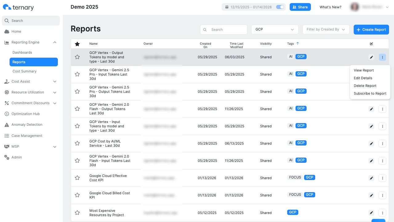
How are reports managed in Ternary?
Reports are managed from the Report Management page, accessible under Ternary Reporting Engine > Reports. This page provides centralized control over all saved reports.
From the ellipses menu next to a report, users can:
- View the report
- Edit report details such as name and tags
- Delete reports that are no longer required
- Mark reports as favorites using the star icon for quicker access
- Create report subscriptions to receive scheduled email updates
Report subscriptions can be configured for both Ternary users and external recipients. Delivery frequency (daily, weekly, or monthly) and delivery time can be customized, and multiple subscriptions can be created for the same report.
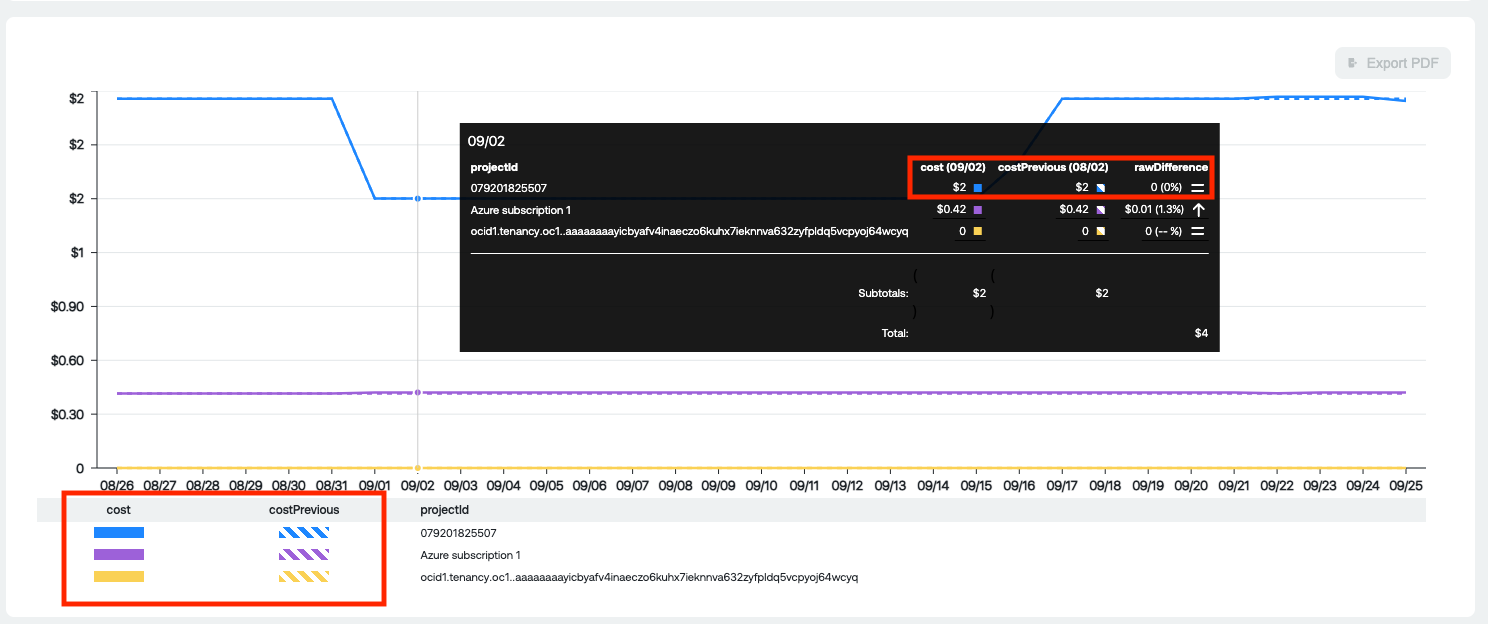
How do time period comparison reports work?
Time period comparison reports allow cost and usage data to be compared across two equivalent time periods within the same report.
To enable time period comparison:
- Select the required measure, groupings and filters
- From the toolbar, select the chart type, date range, and granularity for comparison
- Enable the Compare option and run the report.
- Once enabled, the chart displays the previous comparison period using a dotted line. The table view includes the absolute and percentage difference between periods in the bottom row.
Example Graph representation:
Example Table representation:
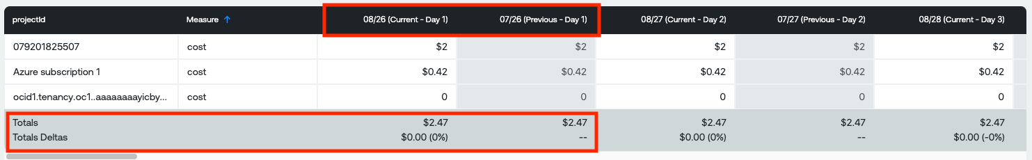
This functionality helps identify trends, anomalies, and changes in spend or usage across comparable timeframes.